
AWS Data Visualization Services: Dashboards & BI Done Right
AWS data visualization services for dashboards and BI. What it takes to build reliable analytics on AWS, and the pipeline behind every good dashboard.
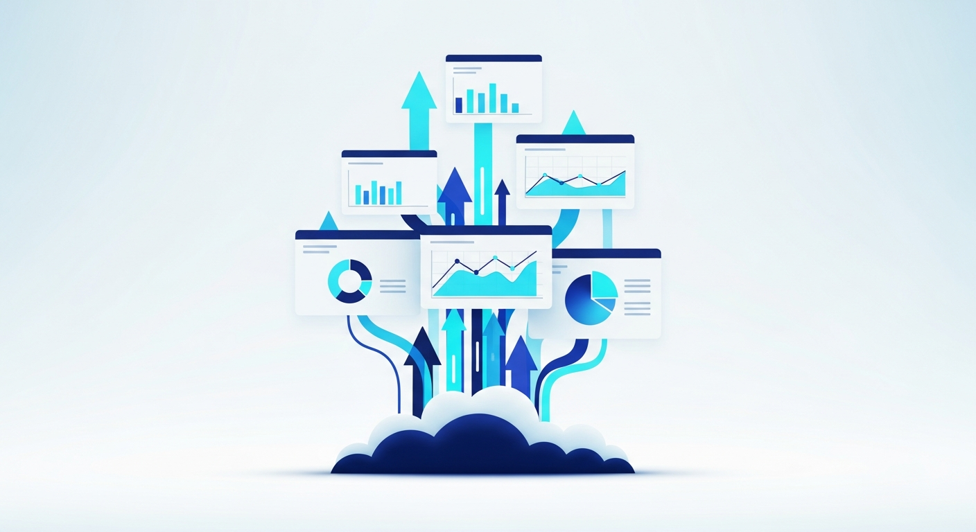
A finance team once showed us a beautiful AWS dashboard their last vendor built. Clean charts, the right colors, executives loved it. It was also wrong — two of the top-line numbers were pulling from a table that hadn't refreshed in weeks, and nobody could tell because the dashboard never said so. That's the whole lesson of data visualization on AWS in one story: the chart is the easy part, and a pretty one built on a broken pipeline is worse than no dashboard at all.
The Pipeline Behind a Good Dashboard
Every reliable visualization sits on top of a chain most people never see. Data gets ingested from your sources — databases, SaaS tools, files. It lands in storage, usually S3. It gets cleaned and reshaped, because raw data is always messier than anyone admits. It gets modeled into metrics that mean one consistent thing. Only then does it reach a chart.
Skip or rush any of those steps and the dashboard still renders — it just renders something untrue. The engineering value is in the layers underneath, which is exactly where cheap dashboard work cuts corners.
What an AWS Stack Looks Like
The specific services depend on your data, but the shape is consistent:
- S3 as the durable, cheap home for raw and processed data
- A warehouse or query engine — Redshift, or Athena querying S3 directly — for analysis at scale
- A transformation step that cleans and models data on a schedule
- A visualization layer — QuickSight for standard BI, or a custom embedded dashboard when the data belongs inside your own product
- Scheduling and monitoring so refreshes are predictable and failures are noticed
Assembling these on AWS rather than a single all-in-one platform keeps you in control of cost as data grows and lets each layer be the right tool rather than whatever the bundle included.
Standalone BI or Embedded
Some clients want a BI workspace their analysts log into. Others want the charts living inside their own app or portal, so users never leave the product to see their numbers. We do both — the embedded route means a custom front end in React and Node sitting on the same AWS pipeline, which is the kind of full-stack data work we build regularly.
How to Tell a Working Dashboard From a Pretty One
Three checks sort it fast. Do the numbers reconcile against a source you already trust? Does it refresh on a schedule you can name, and does it tell you when it last updated? Does a given metric read identically everywhere it appears? A dashboard that passes those is doing its job. One that fails any of them is a slideshow with live-data cosplay — and you'll only find out when a decision gets made on a number that was stale.
Frequently Asked Questions
-
What does AWS data visualization involve beyond the dashboard?
The visible chart is the last step. Before it comes ingesting data from your sources, storing it, cleaning and transforming it, and modeling it into reliable metrics. A dashboard built on a shaky pipeline looks fine and lies confidently. Most of the engineering effort goes into the layers nobody sees.
-
Which AWS services power a data visualization setup?
A typical stack uses S3 for storage, a warehouse like Redshift or queries over S3 for analysis, a processing step to clean and reshape data, and a visualization layer such as QuickSight or an embedded custom dashboard. The exact pieces depend on your data volume and how live the numbers need to be.
-
How do I know if a dashboard is actually trustworthy?
Check whether the numbers reconcile with a source you trust, whether they refresh on a known schedule, and whether the same metric reads the same everywhere it appears. A dashboard that can't be tied back to source data or that defines 'revenue' differently on two screens is decoration, not analytics.
-
Can you embed AWS dashboards into our own application?
Yes. Beyond standalone BI tools, visualizations can be embedded directly into your product or internal portal so users never leave your app to see their data. That usually means a custom front end backed by the same AWS pipeline, which we build in React and Node.
Related Articles
-
Data Analytics Services in Daytona Beach, Florida
Data pipelines, BI dashboards, and visualization built on AWS by a Daytona Beach team — turning the data you already collect into numbers you can act on.
-

Data Analytics in Daytona Beach, Florida
Turn messy spreadsheets into one source of truth and dashboards people actually use, built on AWS by senior engineers in Daytona Beach, with infrastructure you own.
-
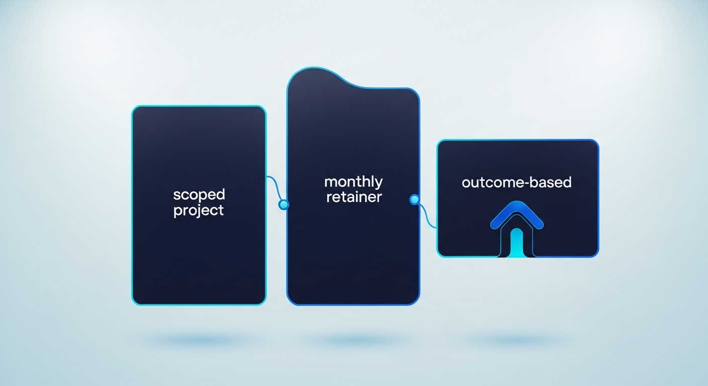
How to Price Data Analytics Services: A Buyer's Guide
Analytics gets priced three ways — scoped project, monthly retainer, or outcome. Here's how each model works and which one protects you as the buyer.