Why Section 508 Compliance Is Actually Just Better Engineering
Most teams treat Section 508 like a last-minute legal hurdle, but building for accessibility forces you to write cleaner code and better UX for everyone.
I’ve spent a lot of time looking at DOM trees that look like someone threw a handful of <div> tags into a blender and hit pulse. We call it 'div soup.' It’s a mess for developers to maintain, but for someone using a screen reader, it’s an absolute nightmare. When we talk about Section 508 compliance, people usually start groaning about checklists and legal requirements. They treat it like a tax they have to pay to work with the federal government.
But we look at it differently.
If your site isn't 508 compliant, it’s basically broken. You wouldn't ship a site where the 'Submit' button doesn't work for Chrome users, right? So why is it okay to ship a site that doesn't work for someone using a keyboard or a braille display? Section 508 isn't some extra layer of features that are nice to have. It’s the baseline for functional software. At Sweent LLC, we’ve built a lot of enterprise-grade systems—from medical device patching tools for Kaiser Permanente to marketing sites for Deloitte—and the lesson is always the same: accessible code is better code.
What are we actually talking about?
Section 508 is part of the Rehabilitation Act of 1973. It says that federal agencies have to make their electronic and information technology accessible to people with disabilities. In the web world, this usually means following the Web Content Accessibility Guidelines (WCAG).
For a firm like ours, this is our bread and butter. We’re a Service-Disabled Veteran-Owned Small Business (SDVOSB) and we hold a GSA MAS contract (47QRAA25D0024). When we build for the government, 508 compliance isn't a suggestion. It’s the law. But even if you aren't chasing federal contracts, the principles behind 508 make your software better for everyone.
Think about it. Have you ever tried to use your phone in bright sunlight and couldn't see the low-contrast text? That’s an accessibility issue. Ever had a temporary injury and had to navigate a site with one hand? Accessibility issue. Better contrast and keyboard shortcuts help everyone, not just people with permanent disabilities. It is the digital version of a curb cut on a sidewalk. It was designed for wheelchairs, but it makes life easier for people with strollers, skateboards, and heavy luggage too.
The Semantic HTML Hill I Will Die On
One of the biggest favors you can do for your future self is using semantic HTML. It’s the easiest way to get 70% of the way to compliance without even trying. We see this all the time: a developer wants a button to look a certain way, so they style a <div> and add a click handler.
<div class="my-custom-button" onclick="submitForm()">
  Submit
</div>
To a sighted user with a mouse, it looks like a button. But a screen reader sees a generic container. It doesn't know it’s interactive. It won't show up in a list of buttons. You’d have to manually add tabindex="0", role="button", and handle the 'Enter' and 'Space' key events just to make it act like... a button.
Or, you could just use the <button> tag.
<button class="my-custom-button" type="submit">
  Submit
</button>
The browser already knows how to handle a button. It’s keyboard-accessible by default. It has the right roles built-in. This is what I mean when I say 508 compliance is just good engineering. You're using the tools the way they were designed to be used. When we were supporting Deloitte's Enterprise Marketing team, translating high-fidelity Figma designs into code meant ensuring that every 'button' was actually a button, not a styled span that would fail an audit.
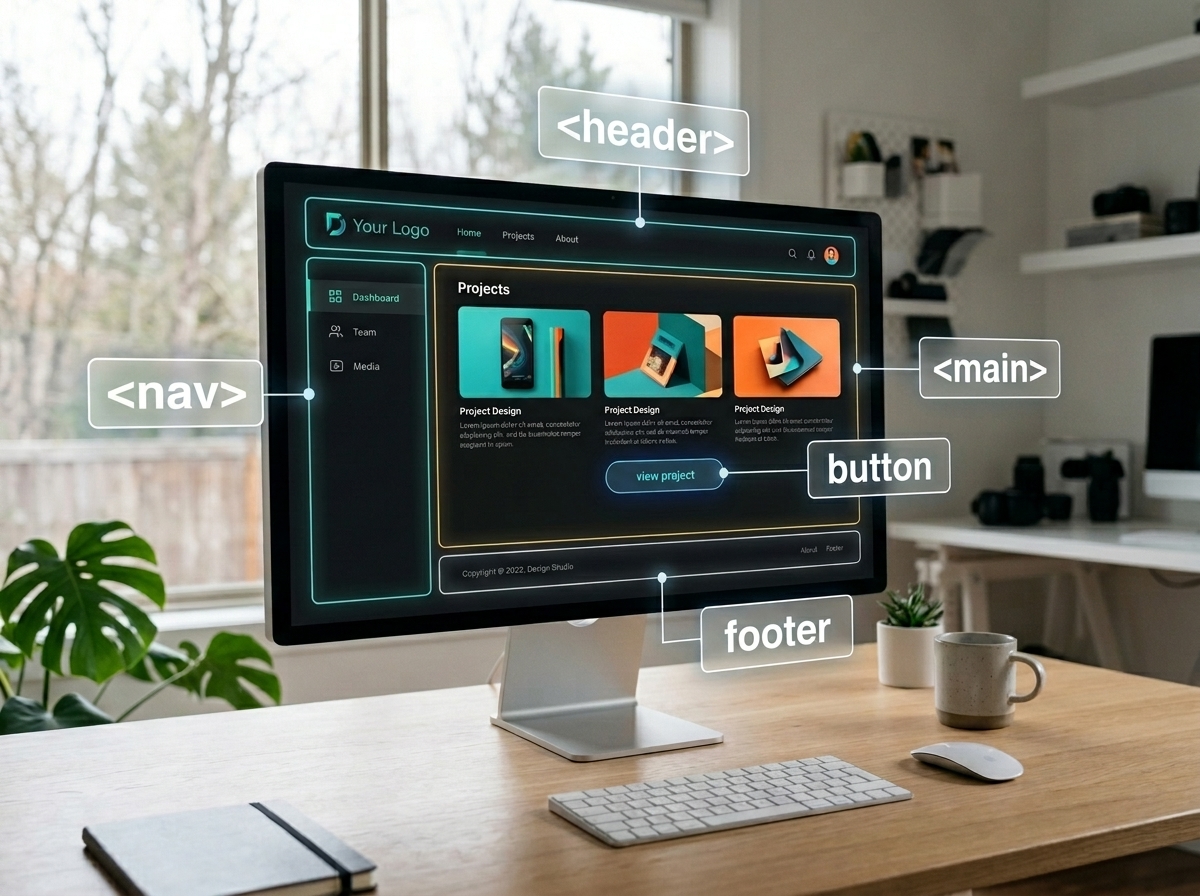
And it goes deeper than just buttons. Using <nav> for your menus, <main> for your primary content, and <header> for your branding gives the browser a map. When you use these correctly, you don't just help screen readers; you make your code easier for other developers to read. I can look at a well-structured HTML file and know exactly what is happening without ever opening a browser. That saves time and money during maintenance.
The Mouse-Free Test
Here’s a quick experiment. Go to your current project, put your mouse on the floor, and try to complete a core user flow using only your 'Tab' and 'Enter' keys.
Can you see where the focus is? If you've hidden the focus ring because your designer thought it looked 'ugly,' you've already failed. If the focus jumps from the header to the footer and then back to a sidebar, your DOM order is messed up.
We ran into this while working on a project for Kaiser Permanente. We were building a tool to manage medical device patching for thousands of devices using IBM BigFix. In a healthcare environment, you can't afford to have a UI that’s confusing or hard to navigate. If a technician is in a rush and can't find the 'Confirm' button because the focus state is invisible, that’s a real problem. We spent a lot of time ensuring that every single action could be triggered via keyboard with clear, high-contrast focus indicators. It wasn't just about compliance; it was about safety.
But focus management gets tricky in modern React apps. When you change 'pages' in a Single Page Application (SPA), the browser doesn't actually reload. For a screen reader user, nothing happened. They're still sitting on the link they just clicked, but the content around them has changed. You have to manually move the focus to the new content or use an aria-live region to announce the page change. If you don't, your 'modern' app is a brick to a blind user.
ARIA is Not a Magic Wand
Accessible Rich Internet Applications (ARIA) attributes are powerful, but they’re often misused. The first rule of ARIA is: if you can use a native HTML element instead, do that.
I’ve seen developers sprinkle aria-label and aria-live on everything like they’re seasoning a steak. It ends up creating a noisy, confusing experience for screen reader users. ARIA should be used to fill the gaps that native HTML can't handle, like complex tab panels or real-time status updates in a dashboard.
If you're building a custom data visualization—something we did a lot for social media analytics suites—you might need ARIA to explain what’s happening in a chart. But for a standard form? Keep it simple. Labels and inputs are your friends.
And for the love of all things holy, please use the <label> tag correctly. Don't just put text next to an input. Use the for attribute to link them. It gives the user a larger click target and tells the screen reader exactly what that input is for. It is a small detail that makes a massive difference in how professional your site feels.
The Myth of the "Ugly" Accessible Site
There’s this weird idea that an accessible site has to look like a plain text document from 1994. That’s just not true. You can have a beautiful UI that is also fully compliant. It just requires some intentionality.
It means choosing color palettes that meet the 4.5:1 contrast ratio for normal text. It means not using color as the only way to convey information. If an error message is just a red border around a box, a colorblind user might miss it. Add an icon or a text label like 'Error:' to make it clear.
Our design team, led by Rita Gonzalez, focuses on this from day one. When we’re in Figma, we’re checking contrast and font sizes before a single line of code is written. It’s much cheaper to fix a design flaw in a mockup than it is to refactor a React component three weeks before launch. We've seen this pay off in our work with the University of South Carolina and NMSU—clean, accessible designs actually look more professional and trustworthy. Good design is inclusive design.
Tools We Actually Use
Automated testing is great, but it’s only a start. Tools like WAVE, Axe, and Lighthouse are fantastic for catching the low-hanging fruit—missing alt text, bad contrast, or duplicate IDs. We integrate these into our CI/CD pipelines using GitHub Actions so we catch regressions early. We even use jest-axe to run accessibility checks during our unit tests.
But automated tools only catch about 30% to 40% of accessibility issues. They can tell you if an image has alt text, but they can't tell you if that text is actually helpful.
<!-- Bad: Not helpful -->
<img src="chart.png" alt="image">

<!-- Good: Descriptive -->
<img src="chart.png" alt="Bar chart showing a 20% increase in social media engagement over Q3.">
This is why manual testing is non-negotiable. We use screen readers like NVDA on Windows and VoiceOver on Mac. We also do 'no-mouse' testing and zoom testing. Have you ever tried to use your site at 400% zoom? WCAG 2.1 requires that your site remains functional without horizontal scrolling at that level. This forces you to write better responsive CSS. It’s not just for people with low vision; it’s for anyone using a small device or a weird browser window size. If your site breaks at 400% zoom, your layout logic is probably too fragile anyway.
The Business Case (Beyond the Law)
If the moral and legal arguments don't move you, let’s talk money. When you build an accessible site, you're expanding your market. In the US alone, millions of people have some form of disability. If your site is unusable for them, you're literally turning away customers. Why would you want to shrink your potential audience?
Search engines love accessible sites, too. Google’s crawlers act a lot like screen readers. They look for headers, alt text, and semantic structure to understand what your page is about. If you've optimized for 508 compliance, you've essentially done a massive amount of SEO work for free. You get better rankings because you built a better site.
And then there’s the maintenance aspect. Semantic, well-structured code is easier to read and easier to debug. When a new developer joins the team and sees a <nav>, a <main>, and a <footer>, they immediately understand the layout. If they see div-1, div-2, and div-3, they have to spend an hour just figuring out where the navigation ends and the content begins. Accessibility is a form of documentation that never goes out of date.
Why We Care at Sweent
We’ve been in the trenches with this stuff. Whether it’s integrating Adobe Analytics for Deloitte or building complex dashboards for NMSU, we’ve seen how accessibility impacts the bottom line.
On the NMSU IT Application Modernization project, we’re migrating legacy Rails apps to a modern React and Node.js stack. One of our big goals is security and compliance remediation. The old apps were built in an era where accessibility was an afterthought. By baking 508 standards into the new React components from the start, we're ensuring the university doesn't have to deal with these same headaches five years from now. We are fixing the technical debt of the past by building a more inclusive future.
It’s about pride in craftsmanship. As a veteran-owned business, we don't like cutting corners. We don't want to build things that only work for some people. We want to build things that work for everyone. Julian Tejera, our founder, spent time in the Marine Corps where mission success depends on every detail being right. We bring that same discipline to our code.
How to Start
If you're looking at a massive legacy site and feeling overwhelmed, don't try to fix everything at once. Start with your global elements—the header, the footer, and the main navigation. If those aren't accessible, the rest of the site doesn't even matter because users can't get past the front door.
Next, look at your forms. Can someone sign up? Can they buy something? Can they contact you? Fix the high-value paths first.
Is it hard? Sometimes. Is there a perfect answer for every complex UI component? Not always. But the effort is worth it. What’s the last time you actually tried to navigate your own site with a screen reader? If you haven't done it lately, give it a shot today. It’s an eye-opening experience, and it’ll probably change the way you write code forever. You might find that the 'bugs' you've been chasing were actually just symptoms of a broken foundation.
Frequently Asked Questions
Section 508 is part of the 1973 Rehabilitation Act requiring federal electronic and IT to be accessible to people with disabilities, in practice enforced through the WCAG guidelines. Beyond law, accessibility enforces cleaner semantic HTML, stronger keyboard support, better contrast, and more resilient responsive layouts — the same qualities that make software easier to maintain, faster to onboard new developers onto, and friendlier to search engines. It's a proxy for baseline engineering quality.
Always reach for the native element first. A handles keyboard activation, focus, and correct assistive-technology semantics out of the box. Recreating those behaviors on a
Automated tools like Axe, WAVE, Lighthouse, and jest-axe catch 30–40% of issues (alt text, contrast, duplicate IDs) — run them in CI. For the rest, use NVDA on Windows or VoiceOver on macOS, navigate with keyboard only, and check 400% browser zoom. For SPA route changes specifically, manually move focus to the new page's heading or use an aria-live region to announce the change — otherwise screen-reader users have no signal that anything happened.
Global elements first: header, footer, and primary navigation. If a user can't get past the front door, nothing else on the page matters. After that, fix the high-value forms — signup, checkout, contact — because those are the paths that directly convert. Semantic HTML, proper on every input, a visible focus ring, and a 4.5:1 contrast ratio will move the needle further than any ARIA-sprinkling exercise.
No. An accessible design only constrains three things: contrast ratios, not using color alone to convey state, and supporting keyboard and zoom. Well-built UI libraries and intentional design systems — starting in Figma with contrast and font-size checks before code is written — produce polished, modern interfaces that also pass audits. Fixing these decisions in the mockup is dramatically cheaper than refactoring React components pre-launch.